Challenge
The company which is a subcontractor in the suspension business mainly focuses on lighting, signs, and acoustics needed a facelift to their branding after 20 years in business with the old branding, except for the branding itself a lot of other materials needed an update as well such as stationary, catalog, stamps and signs.
The client wanted to still be seen as a subcontractor but with a more up-to-date look, at the same time, the client also changed their name from ALEM Teknik AB to Alemtek AB.
Approach
With not just a new branding but a name as well I wanted to keep some of the old feelings to make sure that existing and previous customers can still recognize them.
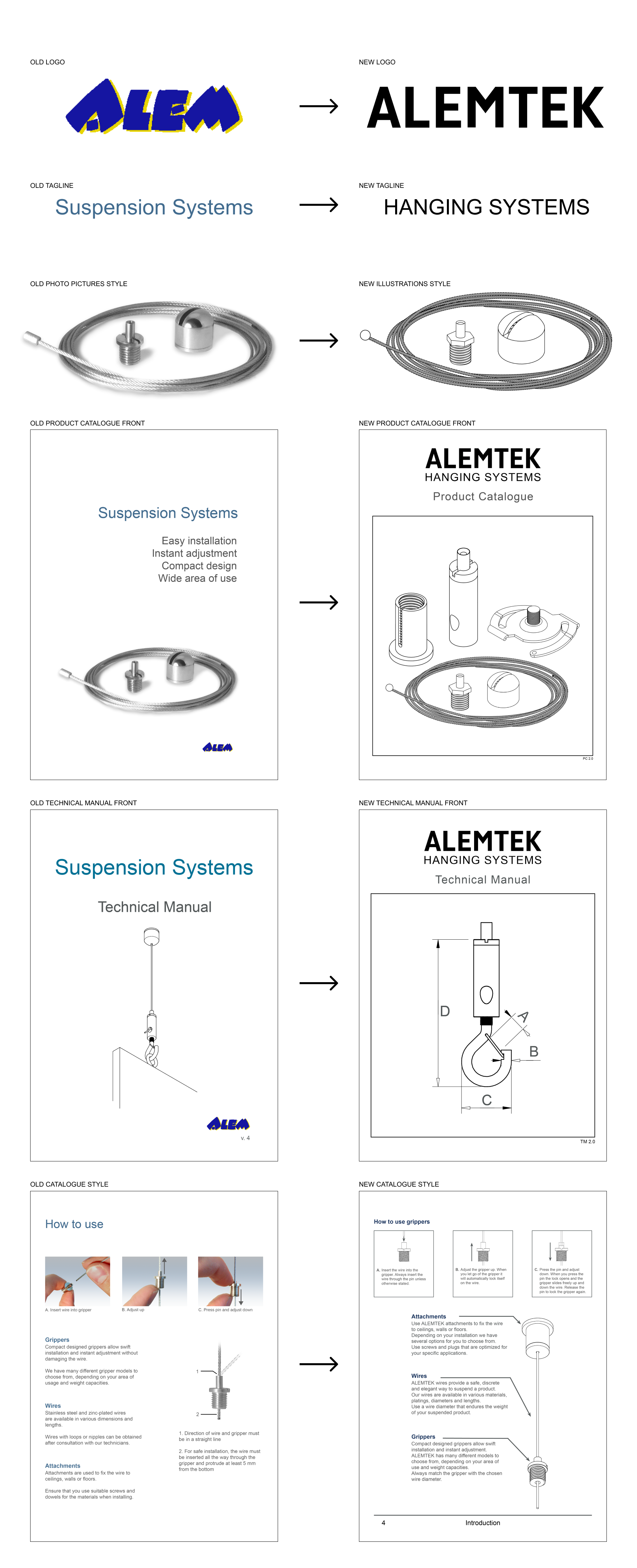
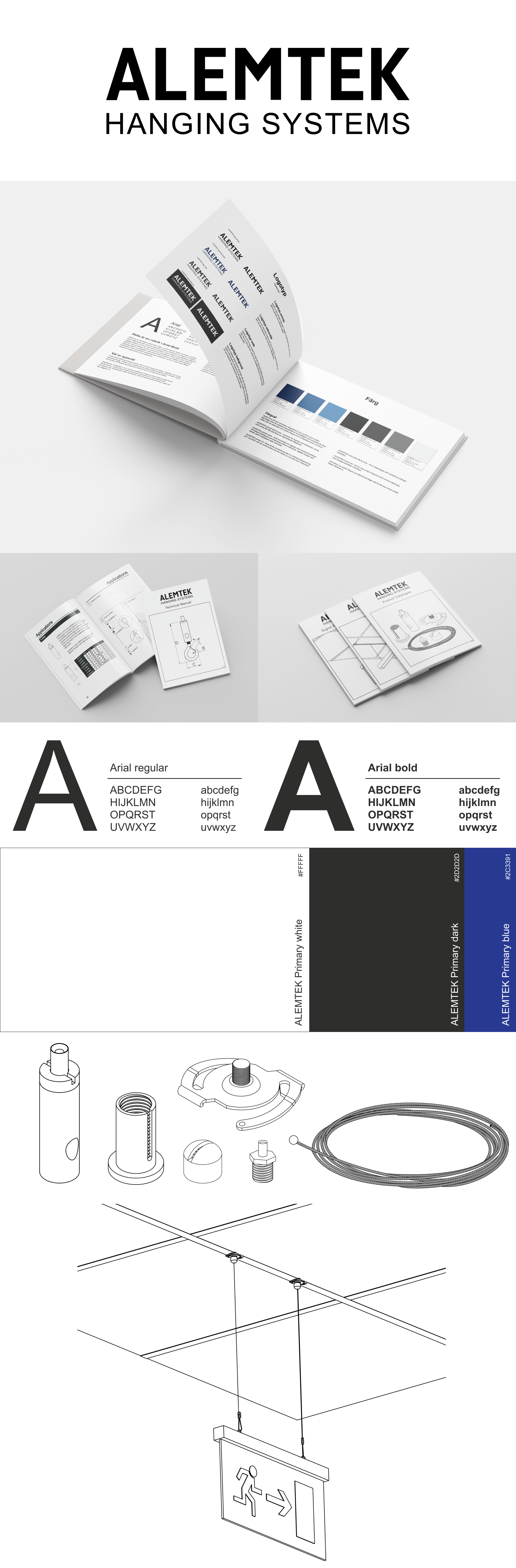
Previously a logotype with only Alem was used and I wanted to keep this feeling with the client being a subcontractor and not in need of a logomark the focus was fully on making a unique but simple and easy-to-recognize, I wanted to do something that gives you a feeling of safety and stable which is some of the clients core values.
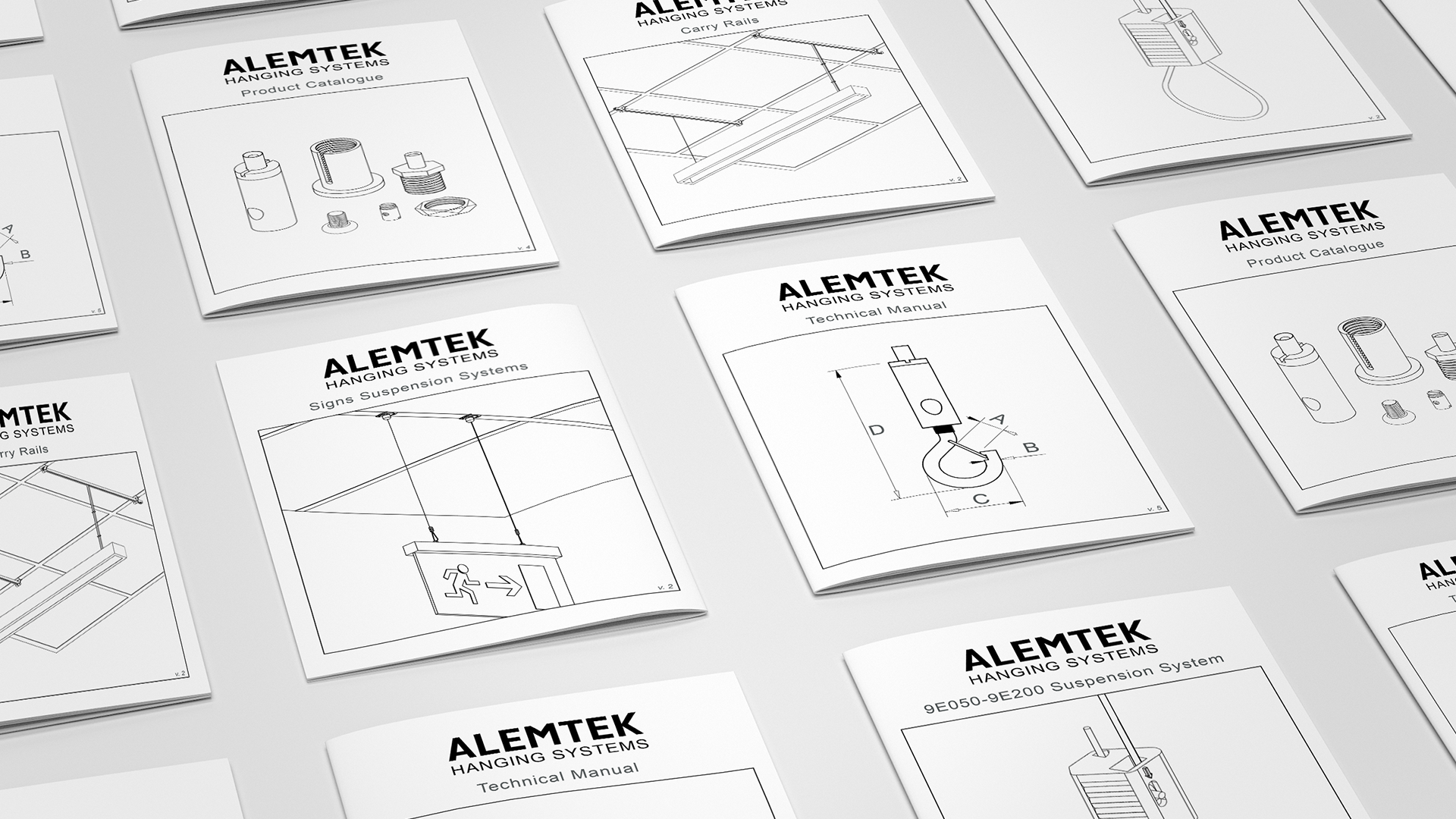
Throughout the years the client had added more and more catalogs and their aesthetics and information were a bit different from each other, I wanted to make sure these were all the same when it came to the info and the looks, and to bind them all together would be a suitable front cover that would easily show it’s ALEMTEK but also which of their catalog with more than just text, working with pictures that could basically describe which catalog you’re looking at.
Result
To give the branding a clean and simple but professional look I ended up using an illustrated feeling to the pictures, this would still convey the important parts of the products such as size, look, shape, and overall feeling of how the products would look like when in use, also it would bind it together with 3d renderings making them more in an illustrated style.
The logotype has a bold and sharp edge structure to it, which is something that will run throughout every graphical detail or a play around it to create a hierarchy within the graphical elements, mainly the logotype is followed by the tagline ‘hanging systems’, the client has used something similar in the past but instead of ‘hanging systems’ they used ‘suspension systems’ things changes with time and the business has changed form saying suspension system to hanging system hence the change in the tagline as well.
The color palette is very simple and reminds a few of their previous colors, using a darker blue as an accent color to black and a darker grey tone, these tones all work well together but on a 60/30/10 scale it would be white(60), black(30) and blue(10).
The finished outcome
The design process