
What did I do to meet the course goals,
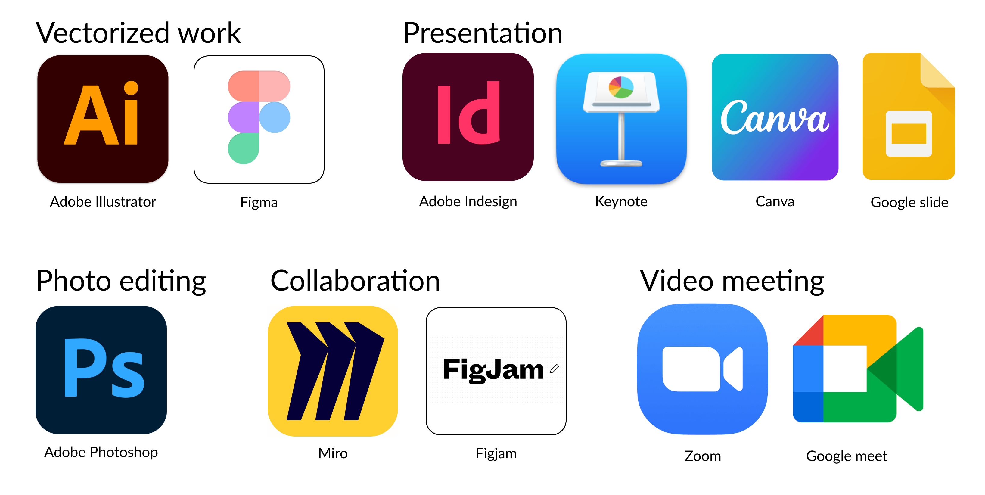
Picture 1: Relevant software for a design process depending on the different tasks.
Figjam and Figma(picture 1) are different software but they’re made by the same developer, both are online live collaborative software meaning that
the whole team can work on the same file and see changes being made live.
The most significant difference between them is that Figjam is sort of an online whiteboard that can be used to simplify the design process
in the early stage while Figma has a lot more tools for the later stages in a design process and is more focused on creating, testing and
presenting different designs.
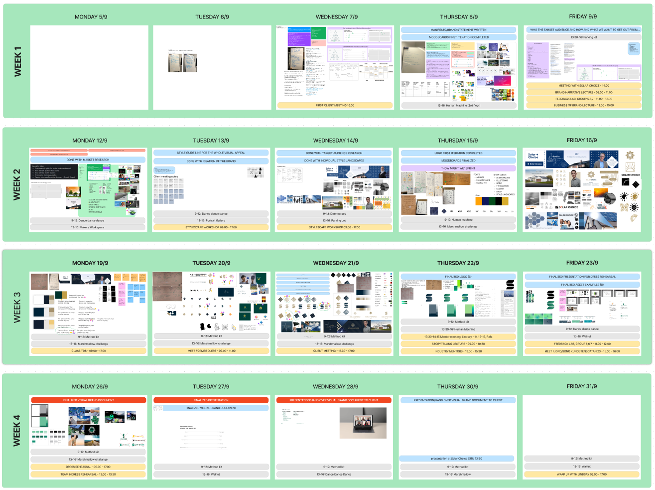
Picture 2: Screenshot of the Figjam calendar I made.
An example of how to use Figjam is that during one project I and my team used this as our main working platform to share and document our
process, I built a calendar(picture 2) in our Figjam file and we put up all deadlines and scheduled events but also we put all of the day’s work
into the corresponding day section to easily backtrack on when and what was done.
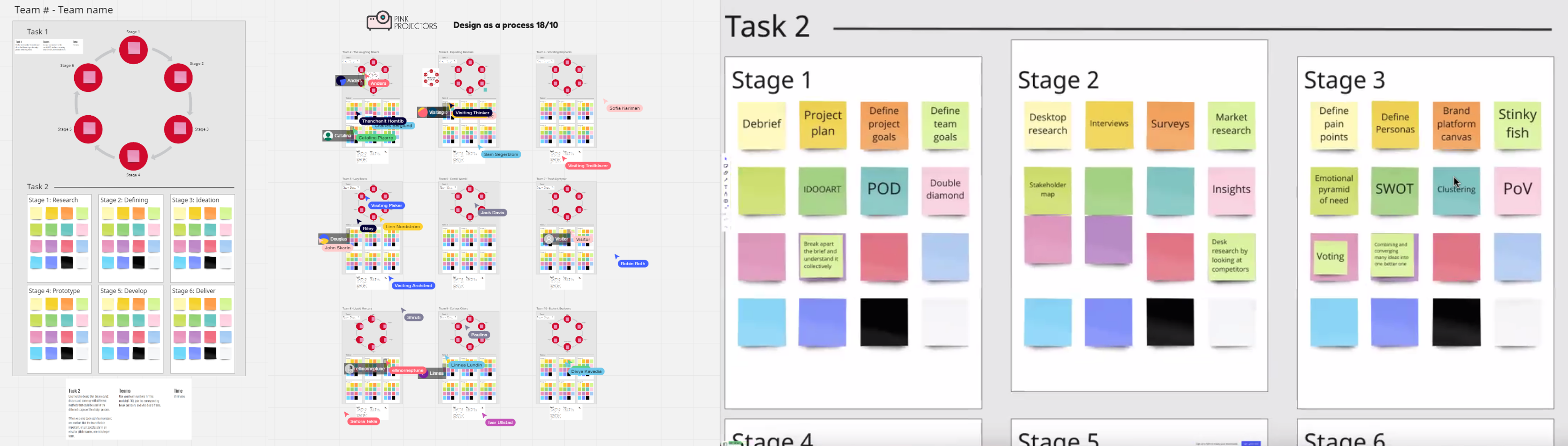
We also used Figjam for different techniques and tools such as clustering(picture 3) the information we got out from interviews, clustering is a
a helpful technique to break down and make it easy to see what information has been gathered that is similar or answers a certain answer
and voting(picture 4) on different designs, voting is a great option to see what the team’s opinion is on different designs or similar situations
when you have several options and need to make a decision of narrowing them down.
Meanwhile, we would focus our design work on Figma since Figjam lacks a lot of the tools to actually create designs, once the designs were
made we would paste them into Figjam to once again keep the documentation throughout the whole project.
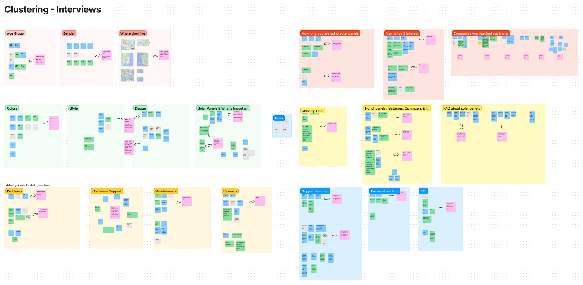
Picture 3: Clustering in Figjam of our interviews.
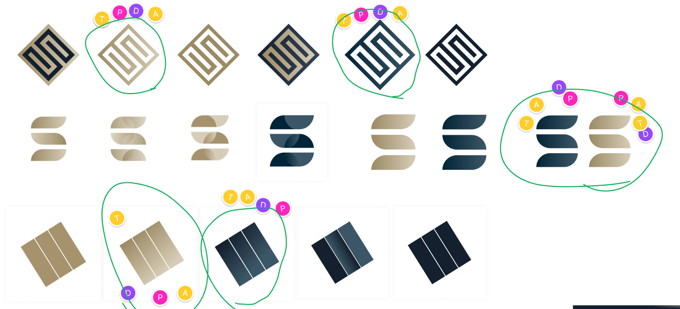
Picture 4: Voting on different designs in Figjam.
During my time on Hyper Island, there are a few tools I keep on using or running into, such as check-in/check-out and Point Of Departure.
Besides these ones, I’ve been introduced to a few new ones such as design style scape, disruptive design(picture 5) & design safari(picture 6).
Both disruptive design and design safari are great tools that are easy to learn and use to yield great results when properly executed,
disruptive design is easy to use when you want to expand your knowledge or to find a new solution during a design process while design safari
is used to expand your knowledge or find new solutions as well, but through going out and leaving the current workspace and getting inspired
by a specific environment.
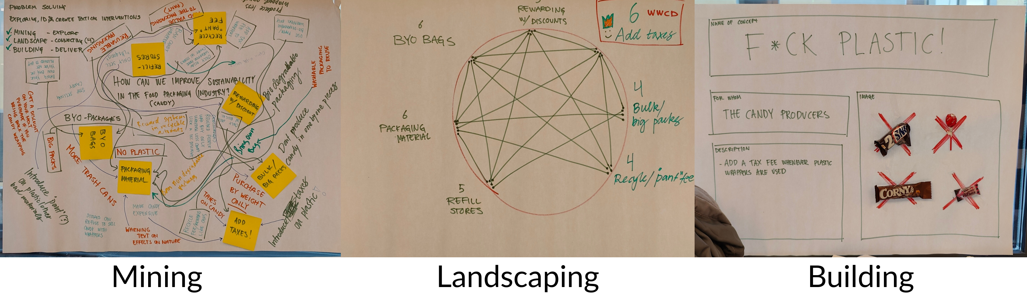
Picture 5: Trying out Disruptive design as a tool for the first time.
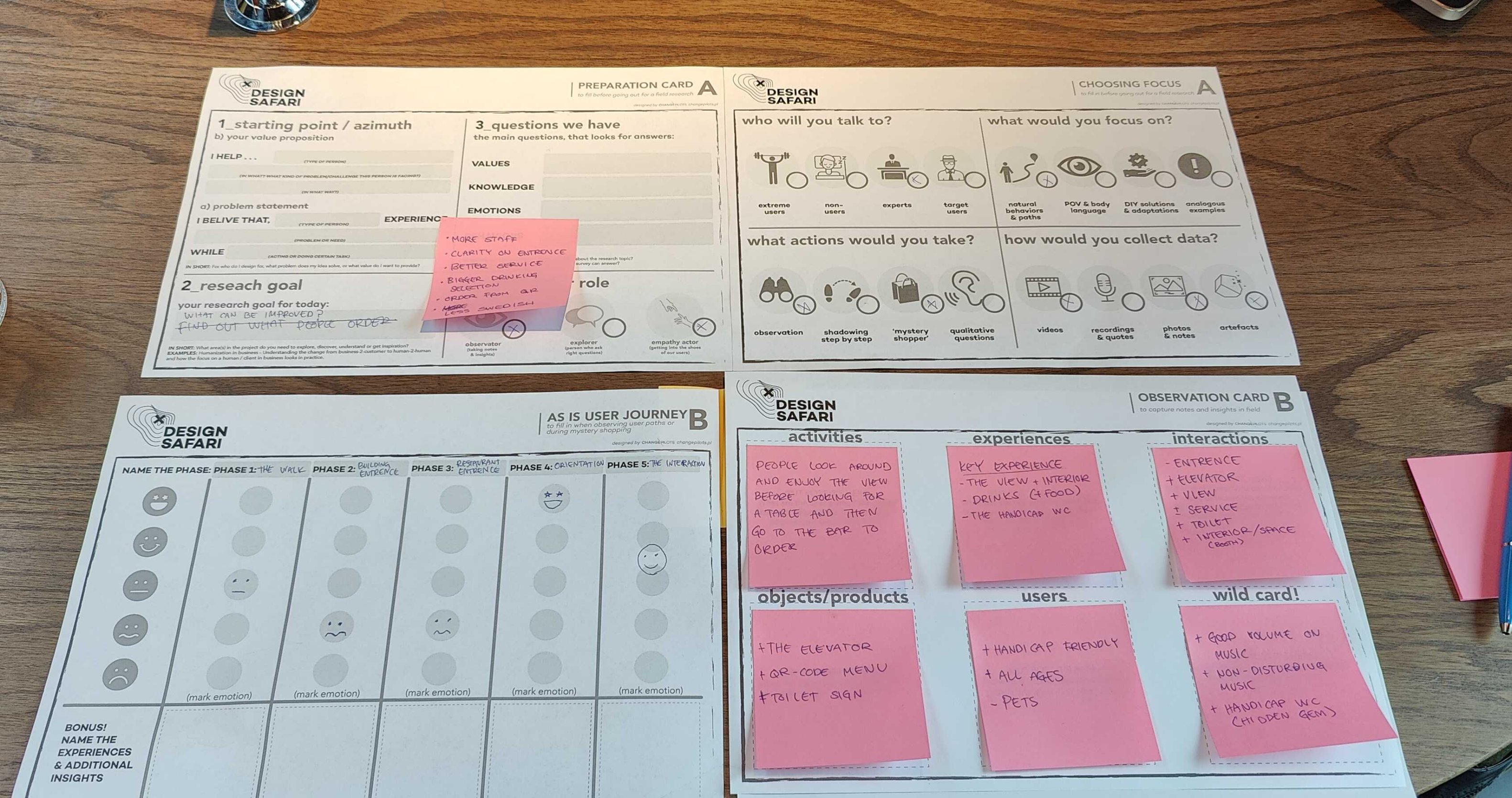
Picture 6: Using Design Safari in a workshop.
What did I learn,
Using Figma instead of Illustrator has been a struggle and designing things has taken 2-3 times as much time to finish but it’s I’ve seen a
the progression that is making me more efficient in Figma.
From time to time I’ve been going back to Illustrator to finish some designs because of time constraints to hit certain deadlines, but I’m still
trying to force myself to use Figma as much as possible.
A lot of new tools to put in my own toolbox, Disruptive design and Design Safari are probably the ones that I like the most, but I’ve only used
them once so far and I definitely need to use them more to learn how to maximize the result, but I do see great potential in them!
And talking about tools, check-in/check-out is something I do admire how good they can be, but despite that, I struggle a lot even if they don’t
need to take a lot of time I’d rather sit down and just start working, so I want to improve and make these more of a standard for me.
What did I do to meet the course goals,
During one of our modules(Your industry), a few groups were talking about legal aspects in different ways e.g the difference between copyright
and trademark(picture 7), copyright covers things such as literature, sound, paintings, books, etc, while trademark covers things such as
symbols, logos, designs, words, and phrases.
We in the digital industry do face trademarks more than copyright even though it’s often misconceptualized and copyright is often used for
both terms.
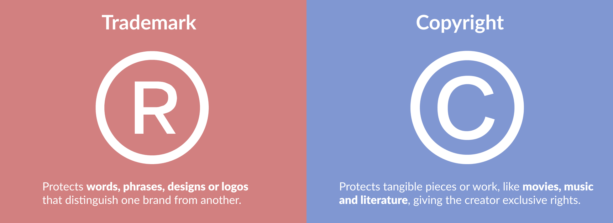
Picture 7: Difference between trademark and copyright
We also had an NDA(picture 8) for another module(branding module) having the client and the team sign an NDA to cover the legal aspects of
who owns what, and what the rights are for using the work. An important since this meant that both parties are now bound to a legal aspect of
this project and needed to follow certain agreed terms, we in the design team also looked at and discussed the NDA, if it was relevant and in
what way so we didn’t just sign something without knowing what it actually meant.
Another legal aspect we’ve tackled was fonts, who owns them, and how they can be used, to move away from any legal aspect in terms of
licenses, EULA(End-User License Agreement), and so on me and my group choose to use google fonts which are free to use for anyone, this
means google owns the fonts and it’s license free for anyone to use for any type of work.
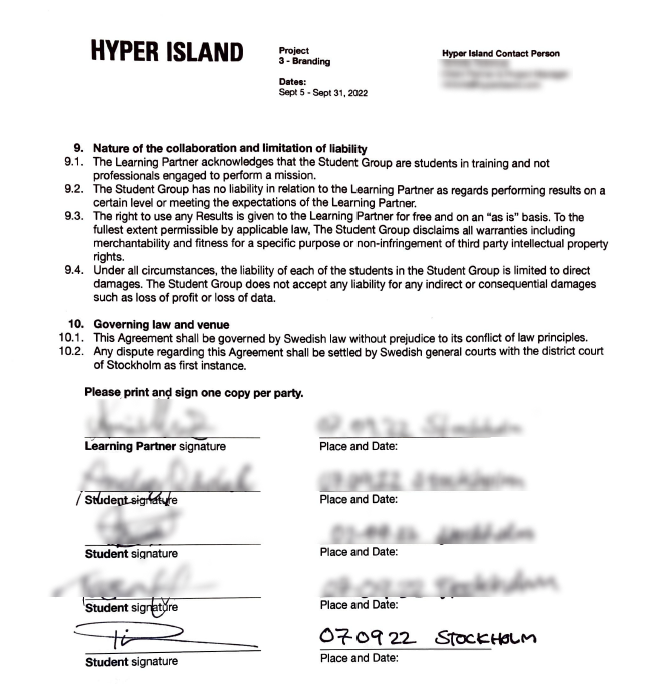
Picture 8: An NDA signed by the team and the client.
What did I learn,
There’s a huge difference between copyright and trademark and the importance of using the right term depends on which one it’s affecting
since there’s a big difference both in what they cover but also how they cover and protect a certain work.
I kind of knew the difference between trademark and copyright but not to the extent I do now, sometimes it can still be a bit confusing for me
but I also lack the knowledge of registering and getting the protection in full work for any work I do.
NDA is important to have when working with clients, if not NDA some sort of agreement that is signed by both parties, which could be a quote
that specifies what each party is guilty of doing and what the timeframe has been agreed on.
I’m used to signing NDA and contracts from work before I joined Hyper Island, but usually, it’s one party making the contract or NDA, and then
both sides sign it, this time around there’s a third party(Hyper Island) who makes the NDA and then us(the design team), and the client needs to
sign it which is a bit different, since none of the parties made the NDA both need to go through it thoroughly and know what’s stated in it.
Overall I find legal aspects really complex and confusing, and this topic is something I generally struggle with but at the same time it’s very
important to know about the subject and what not, to make sure to not break any agreements or do something illegal and get fined and
punished for it later on, but also important to make sure to not put clients in those situations either.
What did I do to meet the course goals,
The pandemic hit the whole world very rapidly and had a major impact on everyone’s day-to-day life no matter where you live or what you
work with, including the design industry.
With this, a lot of people started working more from home and some software became more relevant than ever as remote work was
introduced and nowadays it’s more of a standard and lots of work can be done remotely.
Remote work is a positive thing that came out of the pandemic in my opinion and with it a lot more opportunities, therefore I’ve tried to put my
learnings into it as well, not only having online lectures but also doing online presentations, and facilitating an online workshop(picture 9) for
my classmates.
Picture 9: Screenshots from the online workshop I created and facilitated.
We also see more and more things becoming online, including portfolios. A lot of people use different platforms for this such as
Behance or dribble but I wanted to dive one step further and created this webpage(picture 10) which I not only can use as a portfolio but also
for things such as showing my resume or this assessment.
Something that has been trending for a while is the global smartphone market, this means more users are using smartphones to access the
website and apps, with this we see “dark mode” themes more often if not as a standard for a lot of new designs or even changes in old designs
to apply this to their old designs.
For the past few years, we keep on seeing the trend of simplified logos(picture 11) becoming a bigger thing amongst big companies and brands,
there are most likely several factors behind it but one thing is, it’s not over yet we keep on seeing this phenomenon as we move on every day.
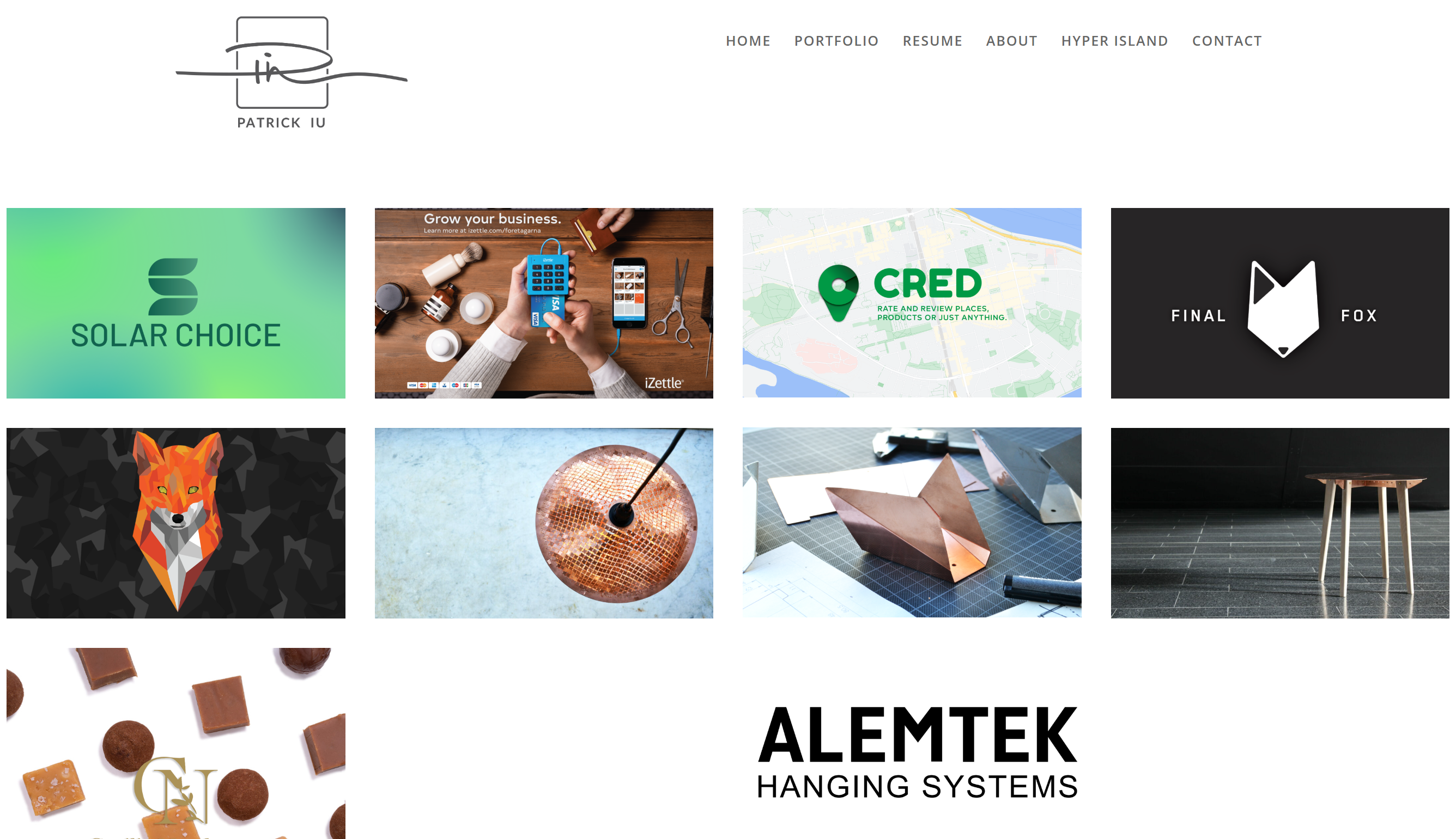
Picture 10: Screenshots of my portfolio website.
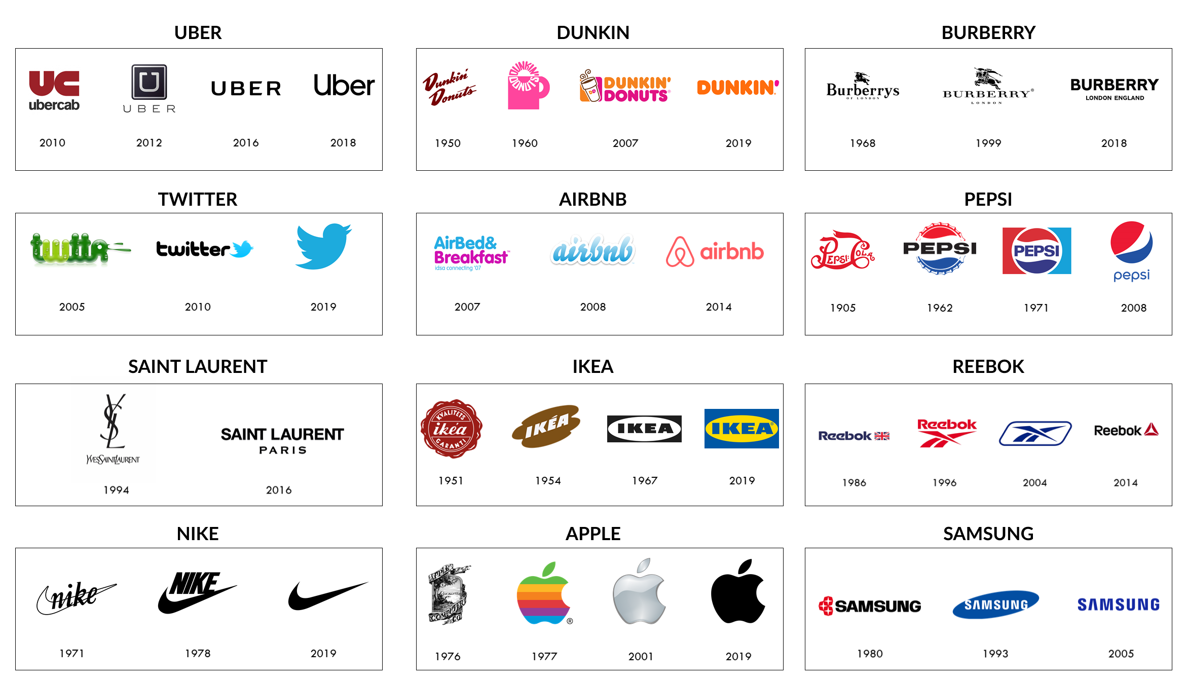
Picture 11: Logo evolution of some big brands(pictures from loka.com).
What did I learn,
I’ve tried to do some group tasks online just to try and force the online perspective and collaboration since I know that is at least one of my
weaknesses, I work better when being on-site and being able to adapt to people’s feelings and moods but also to be able to have direct
communication between each other
Doing this has helped me to get a better understanding of the challenges with working remotely, but also to use more collaborative software
such as Figma, Figjam, and Miro, but the same thing if you’re working on-site and someone is feeling ill, they can still contribute online.
I’ve done homepages like this in the past, but it was probably around 6-7 years ago I updated it, so with this and forcing myself to make one
made me keep up with what was going on and refresh my memory when it comes to coding and layouts as well.
Also that we keep on seeing big brands and companies moving over to more simplified logos for several different reasons, one being to keep
their profile is up to date with what is happening with the digitalization of everything around us, making it more suitable for the digital world.
I believe that simplified logos are great and look aesthetically pleasing while being more modern as well, but if you’re working with a smaller
a brand that might not always be the best choice, and during a previous module, my team was rebranding a smaller company, and we
were a bit divided on what way to go, my first instinct was to treat it like a big brand but got convinced by my team to basically not go that
way and instead we came to a conclusion and met midway basically treating it more as a market-steady brand but not a big corporation.
What did I do to meet the course goals,
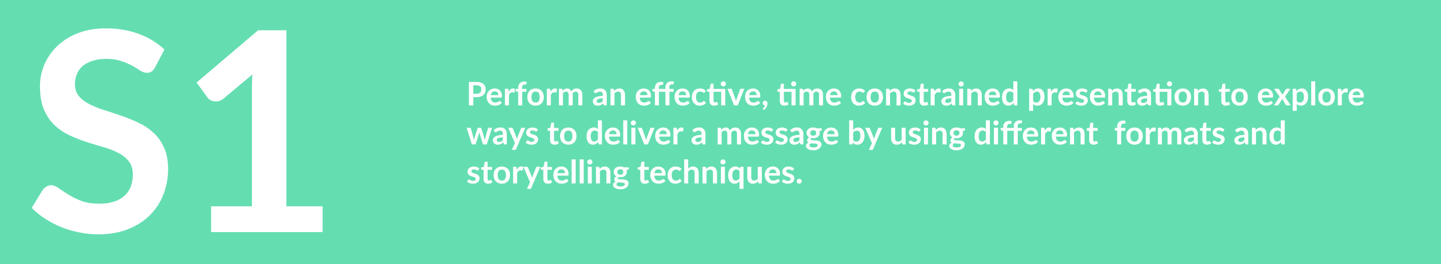
During a previous module my group and I performed a presentation with a very short time constrain, with only 5 minutes, the goal was to try
to use different storytelling techniques to perform this presentation and at the same time deliver a message, our message was to spread the
knowledge of the word and meaning behind “language anxiety” the reason we wanted to spread this is that it’s a problem.
Language anxiety is basically the feeling of worry and negative, fear-related emotion associated with using a language that isn’t an individual’s
mother tongue. And problems can only be solved once they’re known, so therefore we wanted to spread the knowledge.
For our first attempt(picture 12) we didn’t really think too much about the foundation of the whole presentation but just tried to build it up in a
neat storytelling way to keep the audience focused.
Picture 12: The team’s first live presentation(full presentation can be found here)
The whole group worked together to develop the concept for the whole presentation while I also did the graphical work for the slides.
However we would the upcoming week get another shot but this time we had more time on our hands, so we got to learn some new
methodologies around storytelling and tried to polish up the presentation and the whole structure around it before going to round 2 which
would also be presented online through zoom. We had Rob Scotland coming in and teaching us a lot of different techniques(picture 13) and
what to think of when performing a presentation like this online through zoom rather than live with an on-site audience. There’s something
called the hero’s journey(picture 14) which is the concept consisting of 12 steps that every movie hero embarks on their journey, and see if we
could maybe apply something similar to this to our presentation.
Picture 13: Rob Scotland’s concept for making a winning presentation.
Picture 14: The hero’s journey, illustrated by Iskander Krayenbosch.
With no success in implementing the hero’s journey, we started building up our presentation from scratch using a narrative structure(picture 15)
and then rebuilding our slides with the narrative structure as our foundation. After the presentation, some of the feedback we got was
“Using people to say the phrase – was a brilliant proof point”, “The live picture of the zoom screen – VERY VERY SMART”,
“You taught us about the commonality and complexity of anxiety very effectively”.
Picture 15: My group’s layout and narrative structure build for the presentation.
What did I learn,
There’s an endless way to build up an effective presentation using different formats and storytelling techniques and it’s almost a science behind
it, but the most important thing to remember is who the audience is.
The presentation should always be catered to the specific audience it will be presented towards, and the same presentation to two different
audiences could look very different while delivering the same message but with different lingo and visuals to be powerful.
Looking back before my time on Hyper Island I’m used to using storytelling as a tool while working as an esports commentator, but also I’ve
done a lot of presentations on different levels, everything from hosting parties and toastmaster weddings to facilitating and moderating smaller
lectures and seminaries, despite that it never struck me to make scripts because I struggle a lot using scripts rather than just talking straight
from my heart about things, the problem is when I lose myself in the script and I’m not sure how to save it afterward, while if I speak freely
about something I can come up with things on the fly as well as adapting to the audience’s reaction to things and trying to figure out what drives
and makes them more engaged.
What did I do to meet the course goals,
Maybe I’m just an old-school kind of person, but to me, there’s nothing that beats starting using pen and paper no matter what I do it’s almost
always my first choice of weapon to tackle any problem.
Everything from starting to wireframe any kind of presentation or trying to build a foundation for any sort of navigation, I’d start with pen and
paper before moving in to digitalize it with a lo-fidelity mockup and then keep on making it more and more high-fidelity until it reaches a state
as a finished product.
I want to showcase two examples of this, first one is the creation of a logo(picture 16), starting from some early pen and paper sketches of
something that’s supposed to resemble a sunflower that would keep on transforming in 7 different steps before reaching the end goal of a
the somewhat finished product.
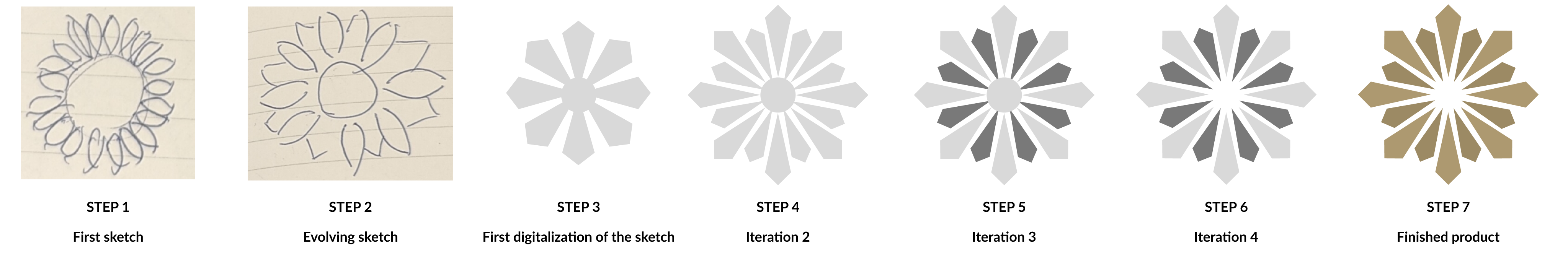
Picture 16: Different stages and fidelity of a logo design from start to finish.
The second example, it’s a little bit of a different approach and transforming an already existing logo into a new logo for a rebrand(picture 17).
Starting off with an existing logo we wanted to keep its shape of it but do smaller changes to make it feel more modern and pleasing but also
fitting to the whole brand we just built for the client.
One of the first steps was to look into how the old design looked and then with smaller tweaks rebuild it from the bottom and make sure
it’s perfect in shape compared to the old one(picture 18).
After that trying to identify what needed to have more depth and how it would become more eye-catching but at the same time keep it
within the frame of the brand itself.
This is just one way of doing it, while there are so many different possibilities I believe this is a good way for both to come up with new logos
but also when redesigning an existing one, no need to reinvent the wheel.
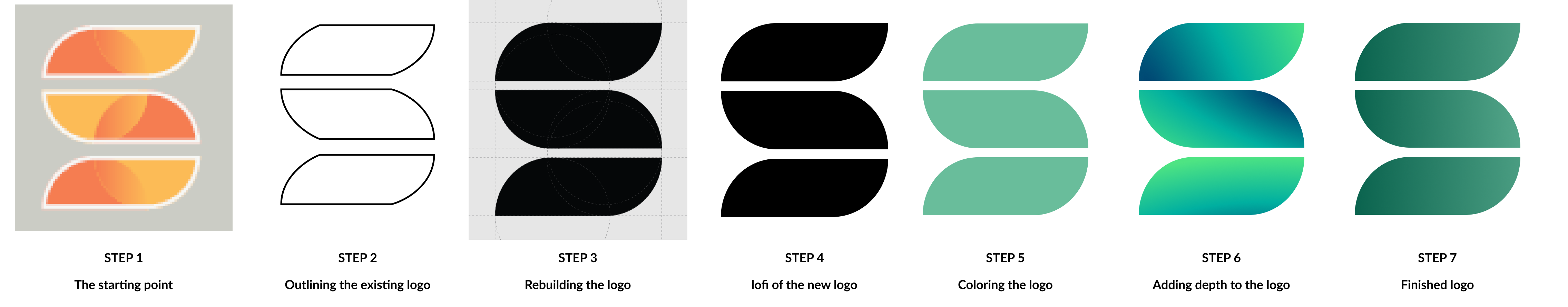
Picture 17: Different stages and fidelity in redesigning a logo.
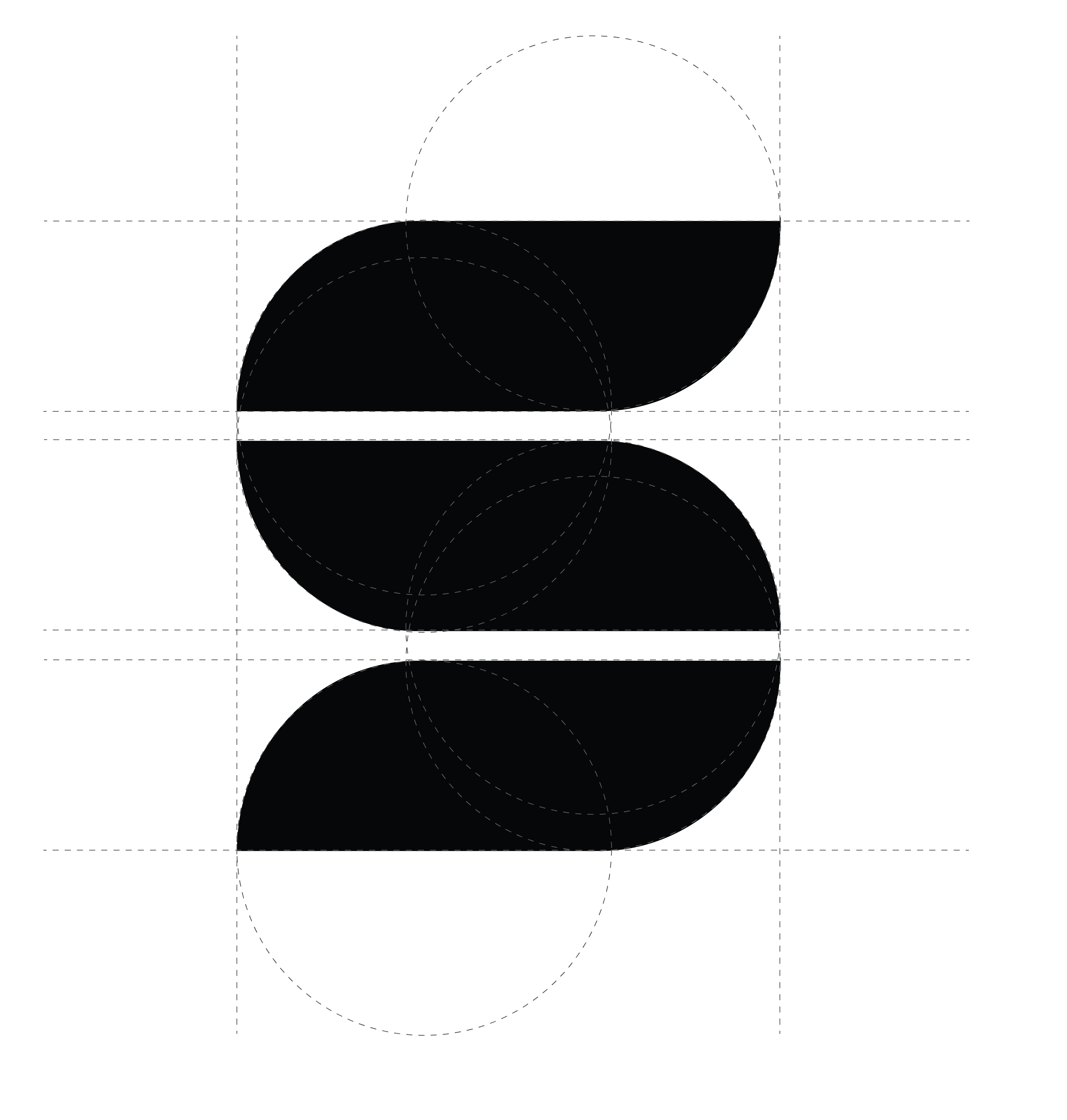
Picture 18: A closer look at the redesign of the Solar Choice logo
What did I learn,
There are different ways of looking into formats and fidelity, the importance of using low-fidelity models at the start of something compared
to high-fidelity is that you get a better overall picture of what it can become.
Using too high fidelity from the beginning might be wasted time but also it makes it harder to see the potential outcome of something because
what you see resembles too much of a finished product rather than a concept.
Save time and effort by going from low-fidelity and carry on before jumping straight into high-fidelity mockups no matter what it is that is
being worked on.
With a lot of freelance experience, something that I struggled with a lot of times is what is the difference in fidelity to other team members, how
much potential can they see or do they need a more high fidelity to see what it could be, I try to see more potential within low-fidelity designs
and trying to see the potential it has, clients are usually different, and almost never want to show a client high-fidelity designs if it’s not far gone
into the process itself with the threat of them thinking this is a finished product.
It has been a struggle to balance the low and high-fidelity designs when showing them to new team members all the time as everyone is different,
this is something I need to keep on working on to figure out what is the best way and how to deliver some ideas or concepts to team members.