

Challenge
Creating new marketing material for a client working within the exclusive chocolate pralines industry on a global scale.
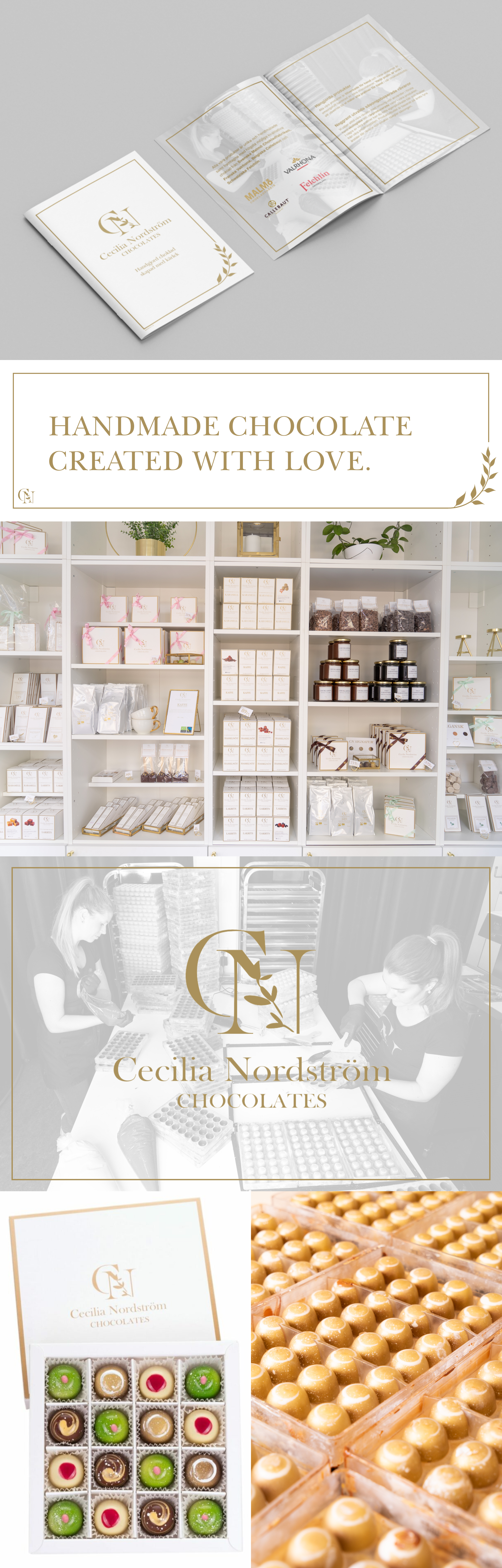
The client didn’t really have a graphical identity but was using two colors, white and gold, the challenge was to create something new and fresh while keeping the existing colors palette and the same sort of aesthetics.
Approach
The idea was to create and give it an exclusive and alive feeling using the existing colors white and gold but adding more space and depth, this would also give it a more exclusive touch rather than the old more basic look.
Wanting to add some more depth and personality I started working with a semi-transparent background with the owners working in their chocolate studio as they do on a daily basis, this gave it the personal touch while adding depth to the catalogs.
Result
With a base layout for the catalogs, I ended up making 3 different ones with unique content depending on what field of business the potential clients would present it to.
They also sent out these catalogs to existing customers since they worked as a product catalog, and they received great feedback on both the looks but also how much easier it became for the customers to see what’s available and how to order it.
The finished outcome
The design process